Learned at Figma - design tools and multiplicative complexity
Figma is my first job out of college and I’ve been there for a little over a year now. It’s a good time to write about my experience and stuff I learned, as I’ve done in the past in internships.
Now, not to spoil too much, but I’ve liked working at Figma so far and I’m still there. So no surprises if, to some extent, I’m hoping you’ll get interested in Figma too. We’re hiring 😉! But as always, my priority is first to try to write something that you’ll find insightful. As I found out, Figma (the application) has a unique combination with properties of both a web app and a game engine. That leads to a lot of fun challenges.
Things I’ll cover:
- Design tools turn out to be quite interesting
- Startup life at Figma
- Multiplicative complexity
- Experiments and side projects
- The culture at Figma
What is Figma?
First and foremost, it’s worth setting a little bit of context. Figma is a startup located in San Francisco, with 70-80 employees total as of writing. We build a design tool for creating user interfaces. Think Photoshop/Illustrator/Sketch. And it’s collaborative (e.g. multiple people can edit at the same time) as it runs in the browser. Think Google Docs. The gist of our business model is to offer a free product to individual and charge teams for advanced collaboration features.
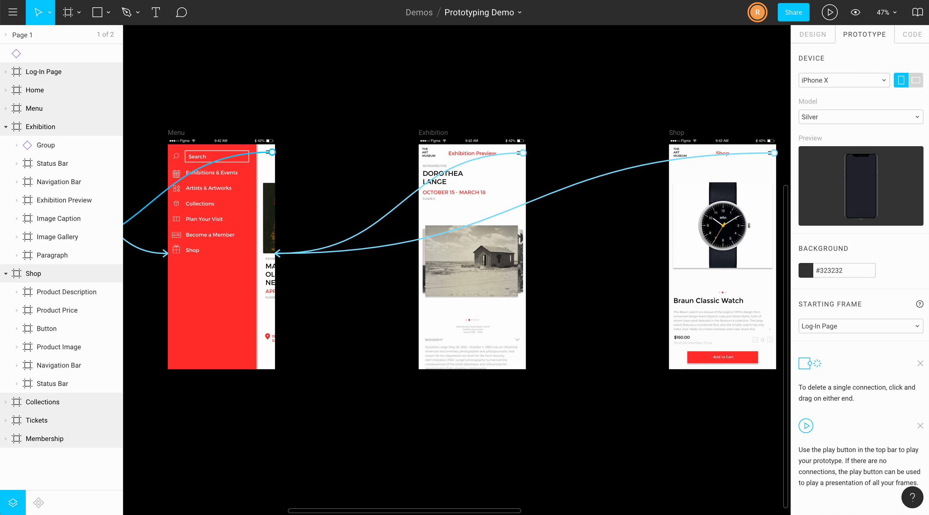
Most of my time has been spent working on prototyping features — that is, features that allow designers to build prototypes of their design by adding interactions in their otherwise static design.
Design tools turn out to be quite interesting
I didn’t know much about design tools when joining Figma. The extent to which it mattered to me is that design tools are interactive content creation tools, and I’ve always liked playing with content creation tools (blender, flash, particle illusion, etc). As a programmer, I also perceive them as being more fun to work on than page-based applications (e.g. most websites). Otherwise, my main attraction to Figma is that they used WebGL and they were being creative in finding ways to run an app on the web that was traditionally in the domain of desktop software. But I decided to let the design space be a known unknown: something I’d figure out once I’m there.
Now that I’ve gotten acquainted with this type of design, I’ve actually been enjoying it a lot. Previously, the word ‘design’ in my head was heavily associated with the word visual. How do you make a webpage look good? But in practice, figuring out the look of the UI is only a small part of the process. There are bigger questions to answer like:
- What are the top use cases for our customers?
- How do we build features that form a consistent system instead of individual ad-hoc features?
- How do we build features that are easy to understand and will do the right thing by default?
So really, these problems become appealing as they are less art problems but rather more psychology problems. No wonder that the famous ‘The Design of Everything Things’ reads more like a psychology 101 book than anything else.
Beyond that, designing a design tool has a lot of different properties than consumer apps. For instance, Figma isn’t something our users use occasionally or passively. Our users are professional designers that often spend multiple hours of their day inside the tool. As a result, they want a lot of things and can be quite opinionated about it. But it also makes it all the more satisfying when we release a new feature and we can see the immediate improvement in their workflow and their direct appreciation.
Indeed, one pleasant surprise is that we interact pretty directly with the customers. While we have long term visions for our product, we’re quite customer-driven in terms of how we prioritize features.
The designer ↔ engineer collaboration aspect is also really fun. Another interesting property of design tools is that it’s usually not as simple as having the designer write up a spec, draw up some UI, and then hand it off to the engineer for implementation. For certain applications, you can often do that because the extent of the interactions with the website is a couple of places to click and a few forms to fill.
But for design tools, you have a highly interactive canvas where the user can assemble all the lego pieces you’ve given them in ways that can get fairly complex. Many variables can affect the experience, such as the number of actions needed to achieve a task, whether those actions are allowed to happen in the order you might intuitively want them to happen, etc. There’s no way to know for sure how good a feature will be until you’ve had the chance to play with it. Furthermore, the complexity of some of the features means there are a lot of cool ideas that are not realistic to implement in a given timeframe, because of one technical restriction or another. All this means that there’s a lot of back-and-forth between engineers and designers which makes the whole process more fun.
Even as I did product work during some of my internships, I never really identified as a product person. I liked reading papers & stuff like compilers. But I’m learning from working at Figma that I am more of a product-oriented than I thought, in large part because the product problems here are fundamentally very interesting.
Startup life at Figma
Usually, when people choose to work at startups, there are recurring reasons for why. You probably heard them: more responsibilities, faster career growth, etc.
I’ve gotten some of that. Previously, during internships, projects were well-scoped projects even when they were technically involved. At Figma, it starts with ‘soooo we’ve been getting a lot of requests about feature X, Y & Z lately, what do they mean?’. And along with the rest of the team, I generally have at least a hand in every step from that leading up to the launch: doing some user research, figuring out which of XYZ is most important, writing up proposals, making estimates, implementation, coordinating with marketing and support, etc.
Having more responsibilities at a startup has been good for growth. While these are certainly not exclusive to startups, my naive new grad self would like to think it’s given me more opportunities to do more things.
Among some things I didn’t anticipate but found fun has been working with the support team to figure out customer problems or sometimes directly providing some support to customers. As part of creating new features, we also invite some of our engaged users to participate in user tests and it’s been fun seeing how they go about using Figma.
Another appealing premise that has held true is that at Figma, you can succeed by pushing the team forward (whereas at larger companies, you have to manage your own career more). I think this is made possible by the fact that the engineering team is still small enough that you can know more or less everyone and what they’re up to. There are career and growth guidelines, but no formal title or performance review system. Presumably we’ll need to have some eventually as we keep growing — they do exist for a reason — but for now I’m content with how things have been.
Lastly, I often get asked about work hours. They’re quite normal. I usually get in anywhere between 9:00 and 10:30, and leave around 6:00-6:30. As is culturally common in tech, people do engage in Slack outside work hours sometimes but I don’t see instances where replies are expected (except when the service is down of course). There’s consideration for work-life balance at Figma, and enough experienced engineers that the work 80h/week startup phase got skipped over entirely as far as I can tell.
Multiplicative complexity
Back to how it’s like to work on a design tool.
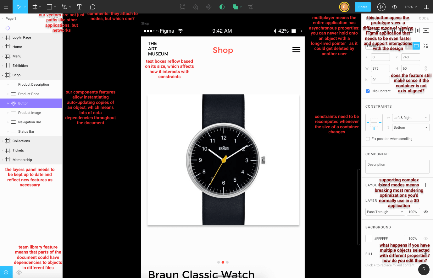
Unlike most applications where different features are neatly separated into different pages, everything in Figma happens in the same space, the canvas. So whenever you intend to add a new type of building block, you might figure out how it’s going to interact with every other building block.
Thus, adding features to Figma seems to have multiplicative complexity as opposed to additive complexity. And I believe it’s an inherent property of the domain space, not a failure of us building poor abstractions. Every time we add a new feature, there are real product decisions to be made when it comes to the interaction with existing features.
For the engineer, this obviously makes the application fun to work on, as even simple features come with fun challenges. But another consequence of this is that since complexity can grow very fast, it needs to be managed carefully. As such, for a startup, I found that people invest a decent amount on the codebase infrastructure and refactor regularly to keep the complexity manageable. It doesn’t mean of course that we have the luxury of spending endless time on technical perfection — every refactor is a project with costs and benefits that need to be evaluated. But the key is that the incentives are there to maintain good engineering practices.
Another interesting thing I learned about Figma that isn’t apparent at first glance is that it has both the properties of a web app and a game engine. It has the properties of web application in that it needs to handle scale, both in terms of number of users and the size of the documents the users create. It also has the properties of a game engine where lots of different components have to interact in the same space and do it in real-time, i.e. at 60fps. Combined, this means there are optimization problems of every flavor: scaling problems, CPU usage problems, memory usage problems, latency optimization problems, etc.

Those milliseconds make a real more-than-milli difference
So work is fun, and I expect work to keep being fun for the foreseable future because those properties are inherent to our product, not just the project I happened to be assigned to. Of course, I could be wrong that our problems are hard, which would put me (us) at a competitive disadvantage. But if you stay in the design tool space for a while, you’ll hear of new design tools being announced every other week that each promises a lot. The rate at which they get delivered is slower, and my guess is that they run into similar challenges we do. 2D design sounds easy (common, how hard can it be compared to all the ✨ 3D tools out there?) but everyone eventually comes to this discovery.
Experiments and side projects
A fun aspect of Figma that I came to understand over time is that there’s both a need and an opportunity for side projects and experimentation.
It’s common for engineers at Figma to spend a little bit of time outside of their main assignment to do various sorts of things. This has included things like writing docs, coming up with a set of eng values, cleaning up our interview process, improving developer ergonomics, trying out a new renderer, or building hacky prototypes of commonly requested features.
The first few are important as a startup grows. Even though not as urgent as shipping the next release, they build the foundation that will allow future structures to stand upon.
Building prototypes has been pretty interesting to me. We have a very long list of feature requests from our users. Many of them are very challenging, both product wise (many approaches) or technical wise. It’s difficult enough to figure out which ones would be the most impactful — it’s even harder to calculate the cost/benefit ratio since it can take days or weeks to understand the requirements well enough to calculate the cost. So there’s a lot of projects that float in the space of “we know it’s important, we’ll do it…at some point”.
When someone builds a quick prototype of these features, the effect is often one of a few things. It turns an abstract idea into a concrete demonstration that people can comment on or suggest improvements to. Demos inspire idea generation and action. It also makes previously big-looking projects seem more achievable, either by showing that the solution turned out to be simple, or that a partial solution would be more than sufficient to satisfy a lot of use cases. For ideas that involve large system changes, it allows validating that the new system would have the intended benefits before investing a large amount of time switching systems in the real codebase.
And we’re able to actually spend time on these 20% time type things, because while we do have deadlines and occasional sprints before launches (it’s important to get things done!), we don’t have them so often that there’s only time for the urgent stuff. It’s not an official policy and there are ways it can be improved (e.g. not everyone might feel comfortable doing side projects) but it’s an interesting balance.
Overall, I think this follows from the property that engineering at Figma is a little too complex for central planning and it’s necessary for individual actors to have agency. It’s not unbounded freedom as the success of the business is still my business. But there is freedom insofar as you have to trust the individuals that the things they think is most important from their local perspective is actually important, and give them the freedom to act on it.
The culture at Figma
One of the great things about working at Figma is it’s culture. But the idea of a company’s culture is a challenging concept to capture and Figma’s culture isn’t very colorful in the sense that it doesn’t have a very standout/distinctive trait like some other places (e.g. “be a host” or “know what you don’t know”).
If anything, it would be more that people at Figma on average are very thoughtful, and this translates into a lot of small things done well. Our code review process is your usual Github workflow, but people are pretty good about using it as a teaching tool rather than a gatekeeping tool. We use fairly standard programming languages (e.g. C++, Javascript, Ruby), but in a way that’s generally quite understandable and avoids major pitfalls. We don’t have an elaborate system of peer review and promotions, but there a lot of avenues like 1-1s to get feedback and achievements are given recognition publicly. We have a pretty standard format for interviews: 10 min of introduction/chatting about background, 45 minute of coding and 5 minutes of ask-me-questions, but we avoid asking unrealistic algorithm questions that characterize some of these types of interviews and let people code on their own laptops. Leadership cares about diversity, but by getting a lot of feedback internally and externally, not just tacking it onto the company values.
We also have a set of official company values and a set of engineering values. I won’t be doing them justice with a single paragraph in this blog post, but definitely ask us about it if you come visit 🙂.
Of course, when it comes to something like culture, nothing is ever perfect. As I’ve written before, every company has some boundary (often defined by the needs of the business) where tradeoffs needs to be made. As a simple example, we have large open lunch tables where people trickle in and out. It’s a great way to get the chance to interact with everyone at the company, but makes it difficult to go into depth in a topic as that requires building context and exclude the people who trickle in. But if thinking about these tradeoffs means we’re reasonably close to that boundary, then I think we’re in a good spot!
Thanks to Shirley Du, Andy Zhang, Jamie Wong, Susan Wang and Ryan Kaplan for reviewing this blog post!


